
Chat Message Component
A flexible, variant-rich component designed for scalable chat experiences.
Built to handle multiple states and contexts while maintaining visual consistency and clarity.
Part of my modular UI component system, used across various prototypes and design explorations.
Purpose & Concept
The Chat Message component standardizes how messages are displayed within a conversation view. It supports both sent and received messages and adapts seamlessly to different states like delivery status, reactions, or grouped messages. The goal was to create a single, flexible structure that minimizes redundancy and ensures visual harmony across chat modules.

Component Anatomy & Variants
Each message is built from a consistent structure of subcomponents.
Through a single master component and its variants, all message types — from simple text bubbles to grouped or reacted messages — can be displayed seamlessly.
This design allows designers to adapt the component quickly for any use case, without rebuilding layouts or breaking consistency.
The structure is modular, the variants are logic-driven — making this component both efficient and scalable.
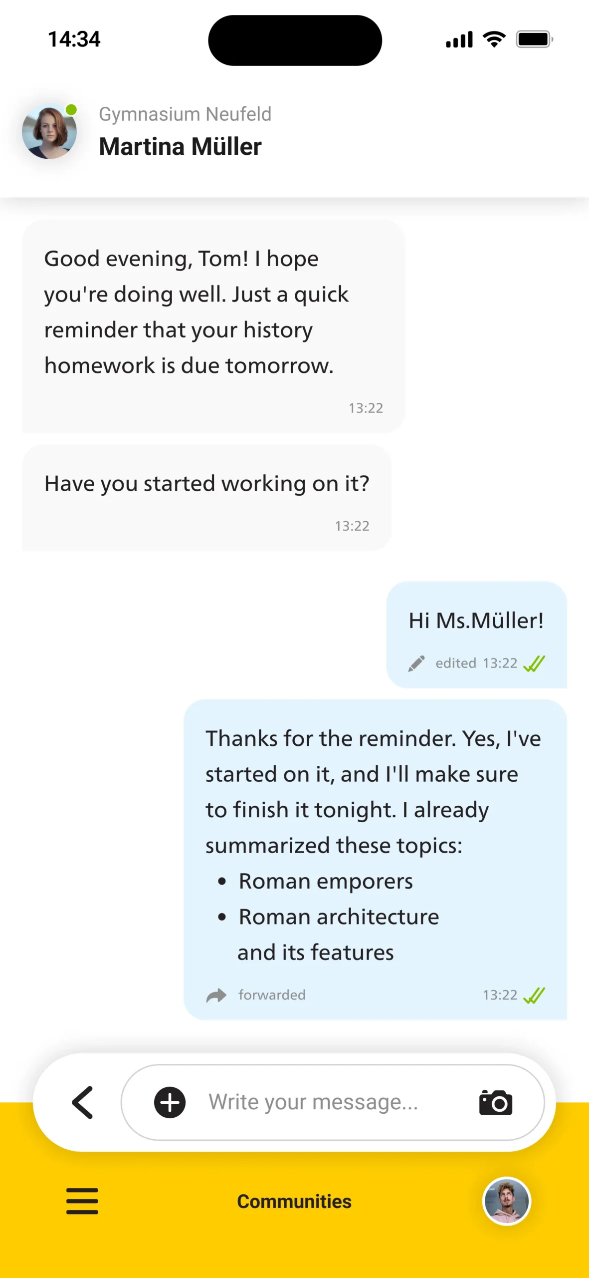
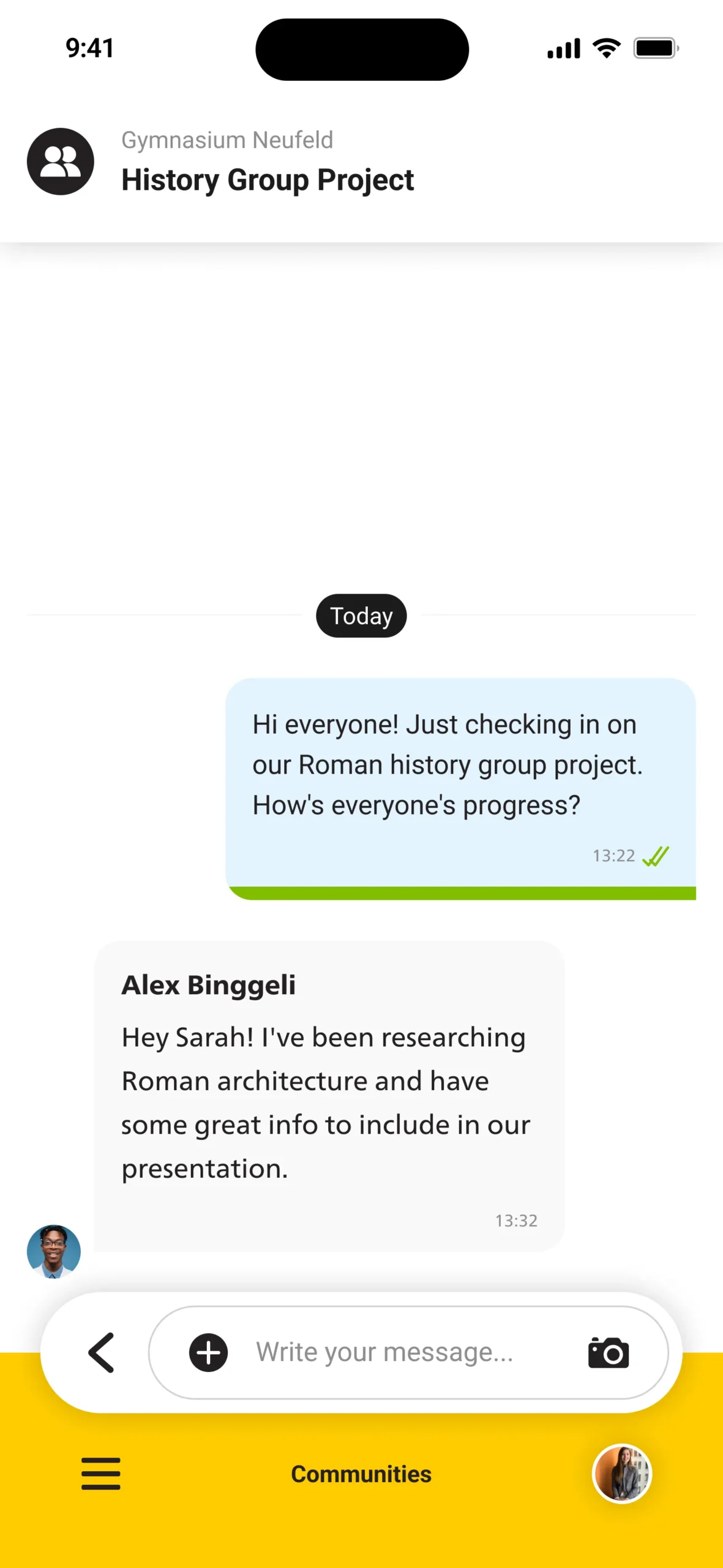
Sent
Without Avatar, but a Status Bar for how many group members already read the message.
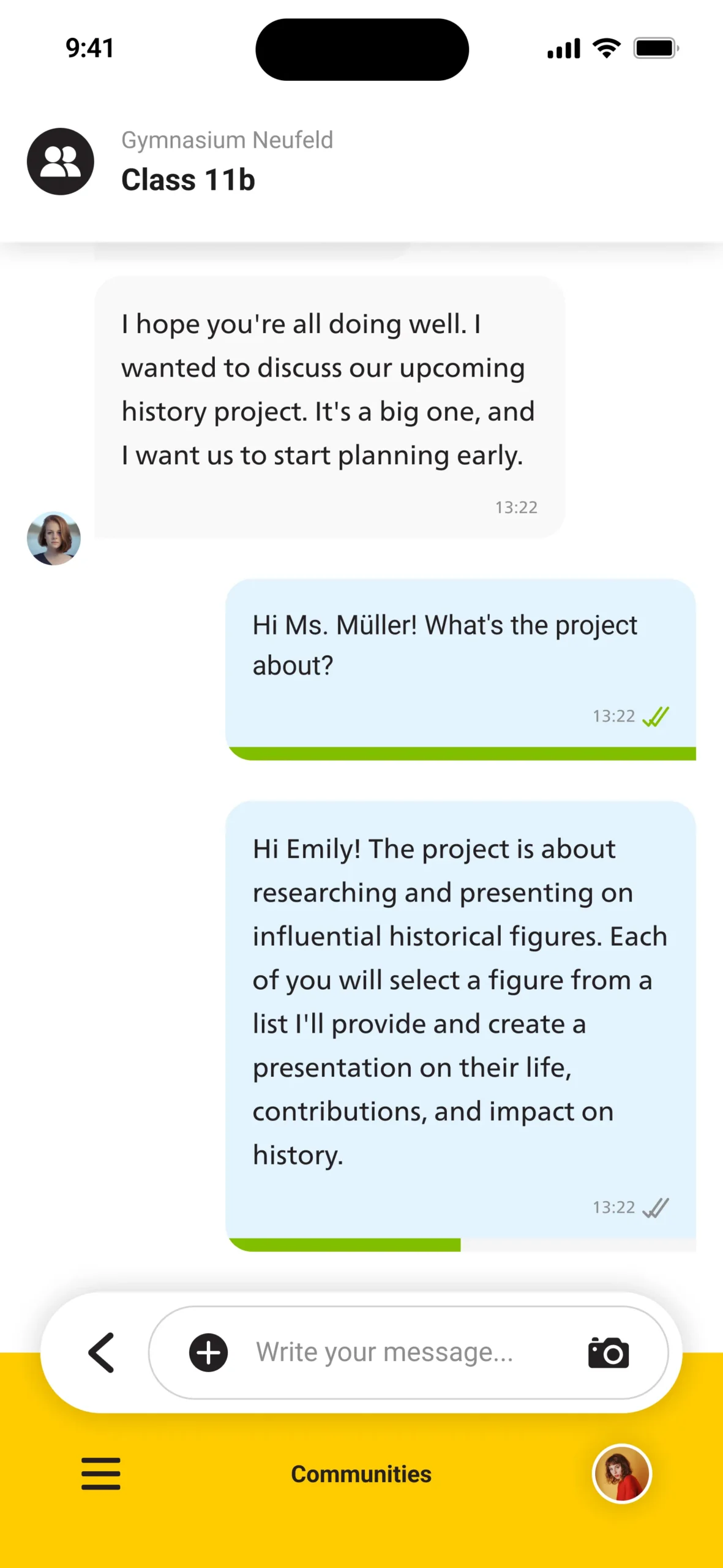
Received
With Avatar and Name of Person that wrote the message, no Status Bar or Read/Received Indicators.
With Reactions
Message including emoji reactions below the bubble, displaying user feedback and engagement counts.

Without Reactions
Clean layout without any reaction bar, keeping the focus on the message content itself.
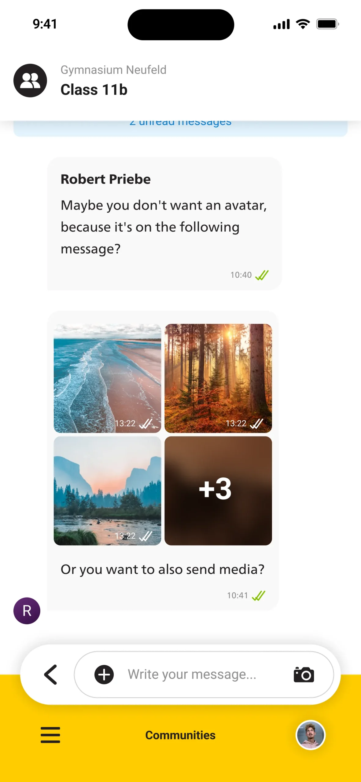
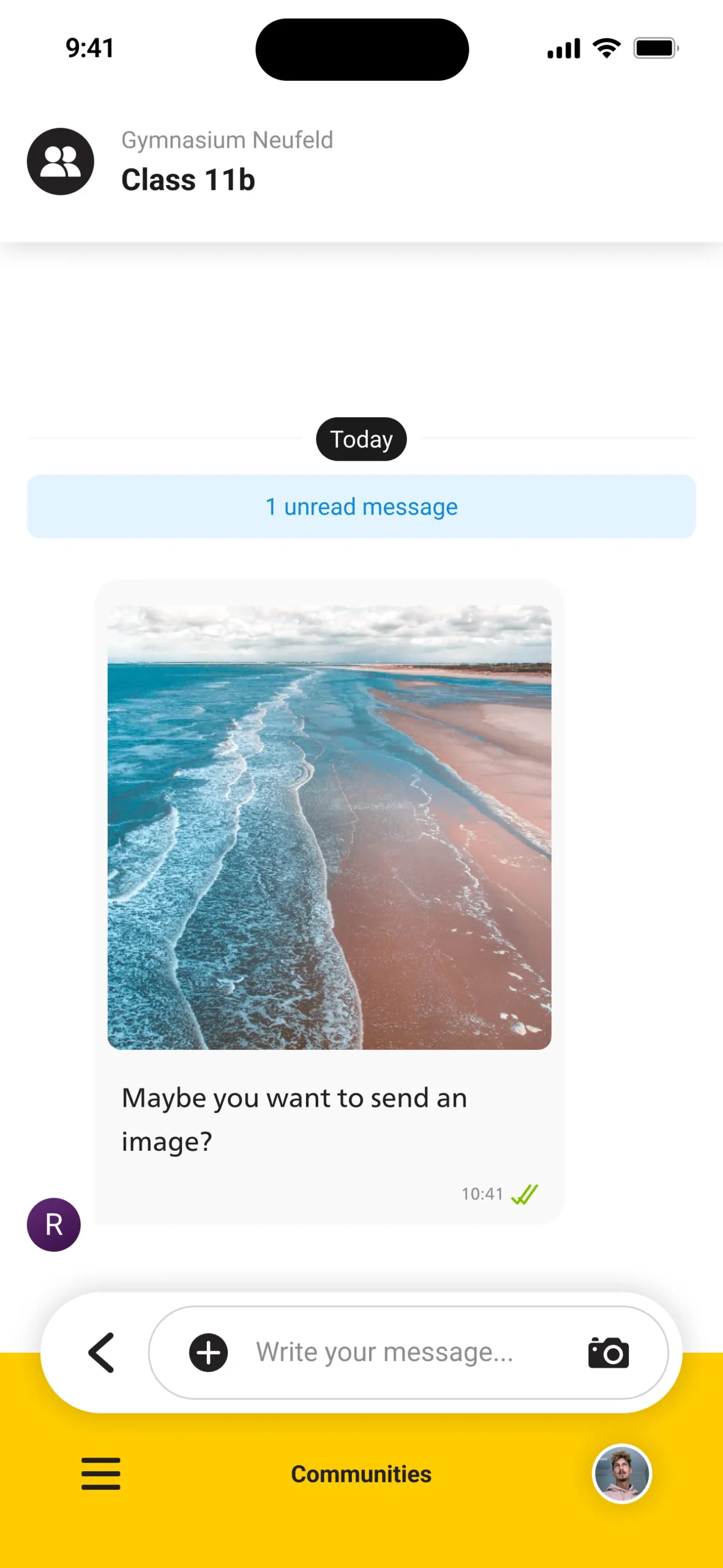
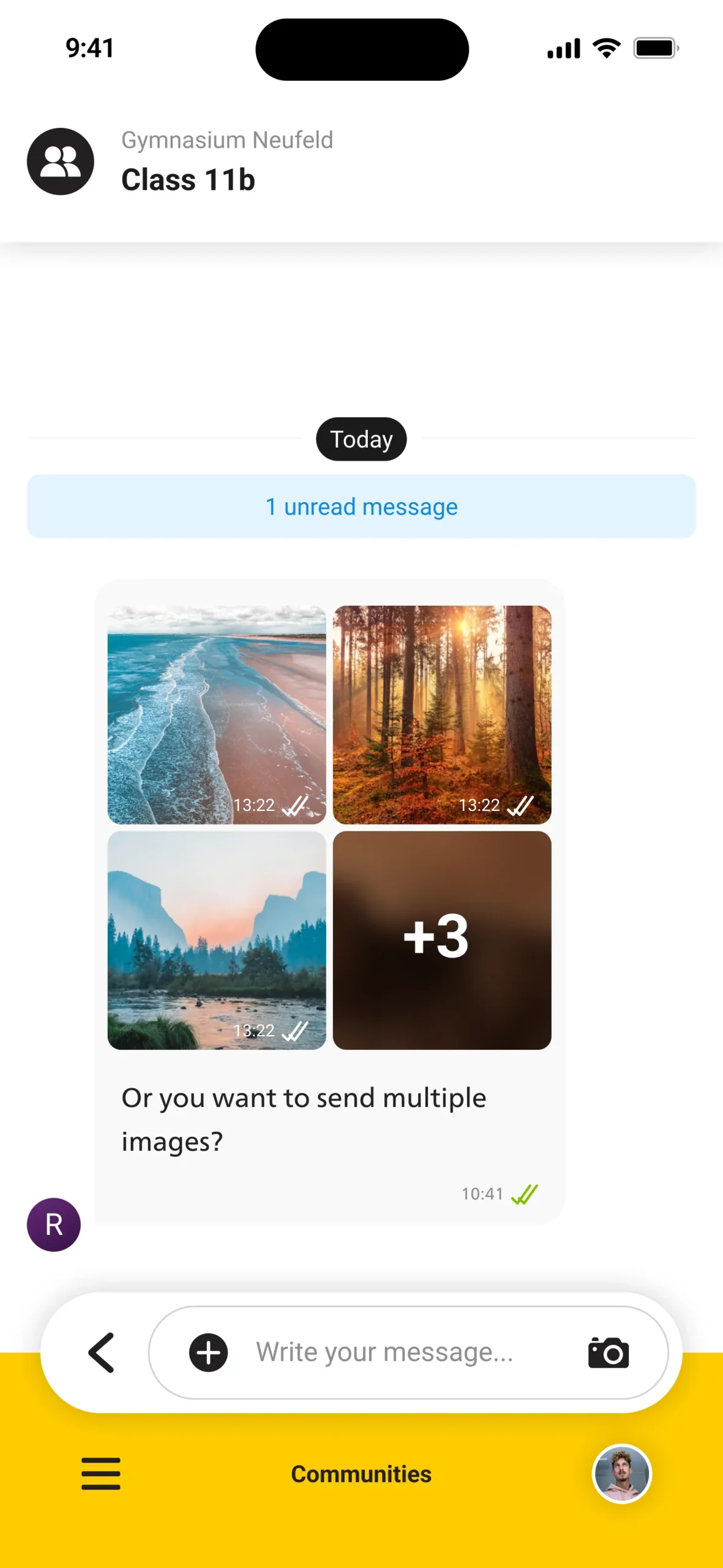
Media
Message containing a single attached image, displayed with compact bubble framing and subtle caption area.
Multiple Media
Message containing multiple media items — images stack neatly with consistent spacing and preview alignment.
Edited
Message showing edit or forward labels, visually distinguished through metadata below the main text.
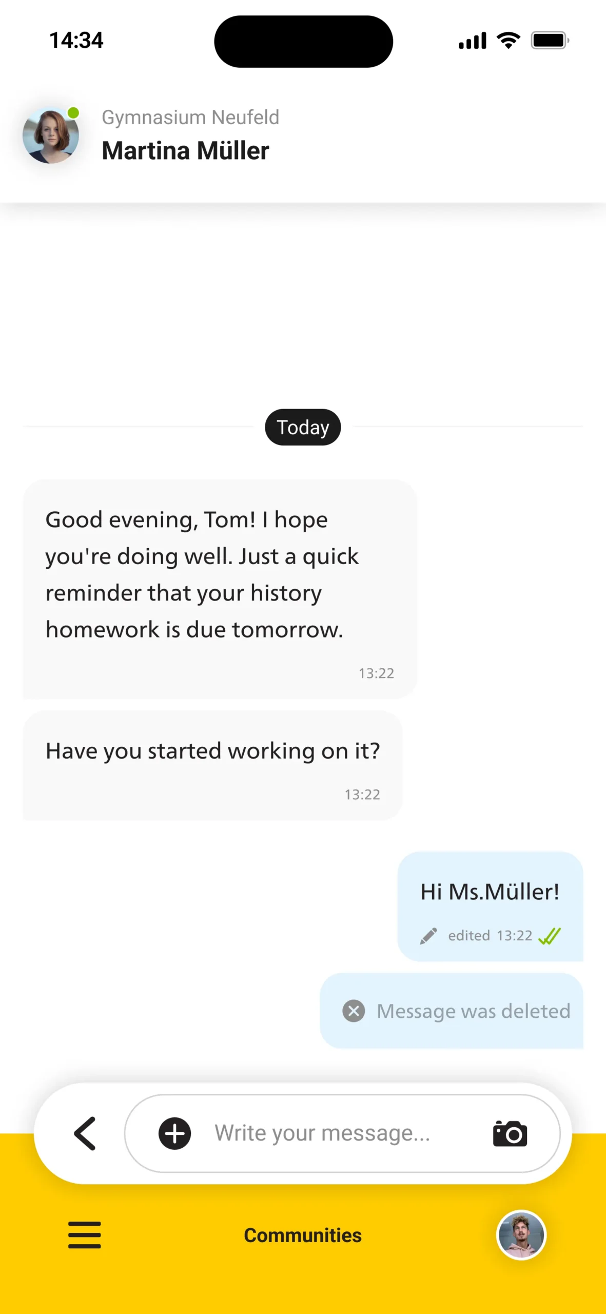
Deleted
Deleted message replaced by a neutral placeholder text, maintaining conversation flow without visual clutter.
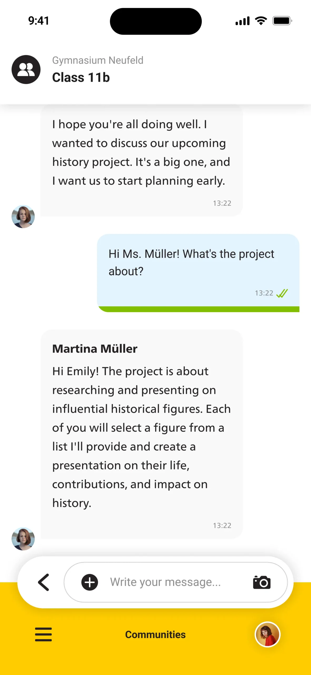
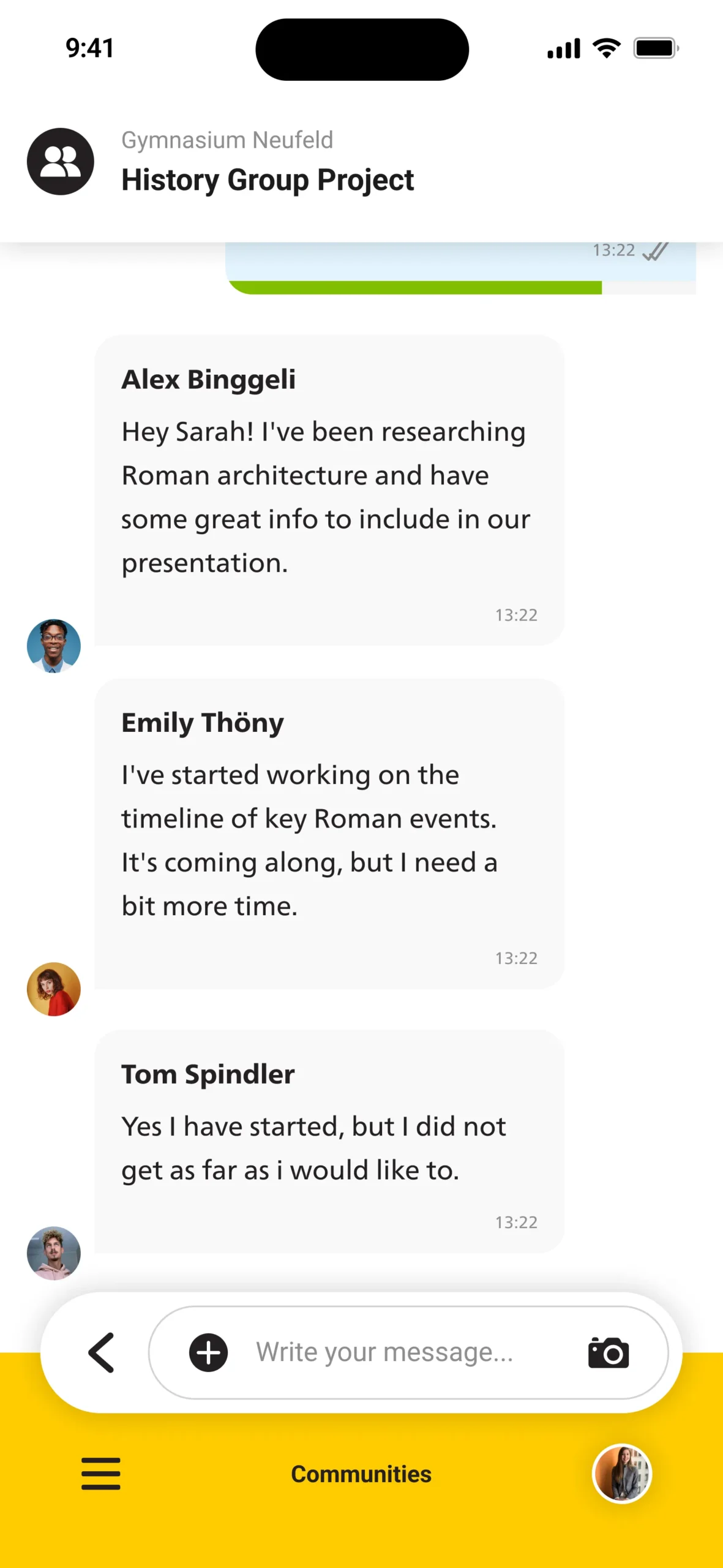
Different Authors
Messages from different participants each include their avatar and name for clear sender distinction.
Same Author
Consecutive messages from the same person automatically collapse avatar and name to create a grouped thread.
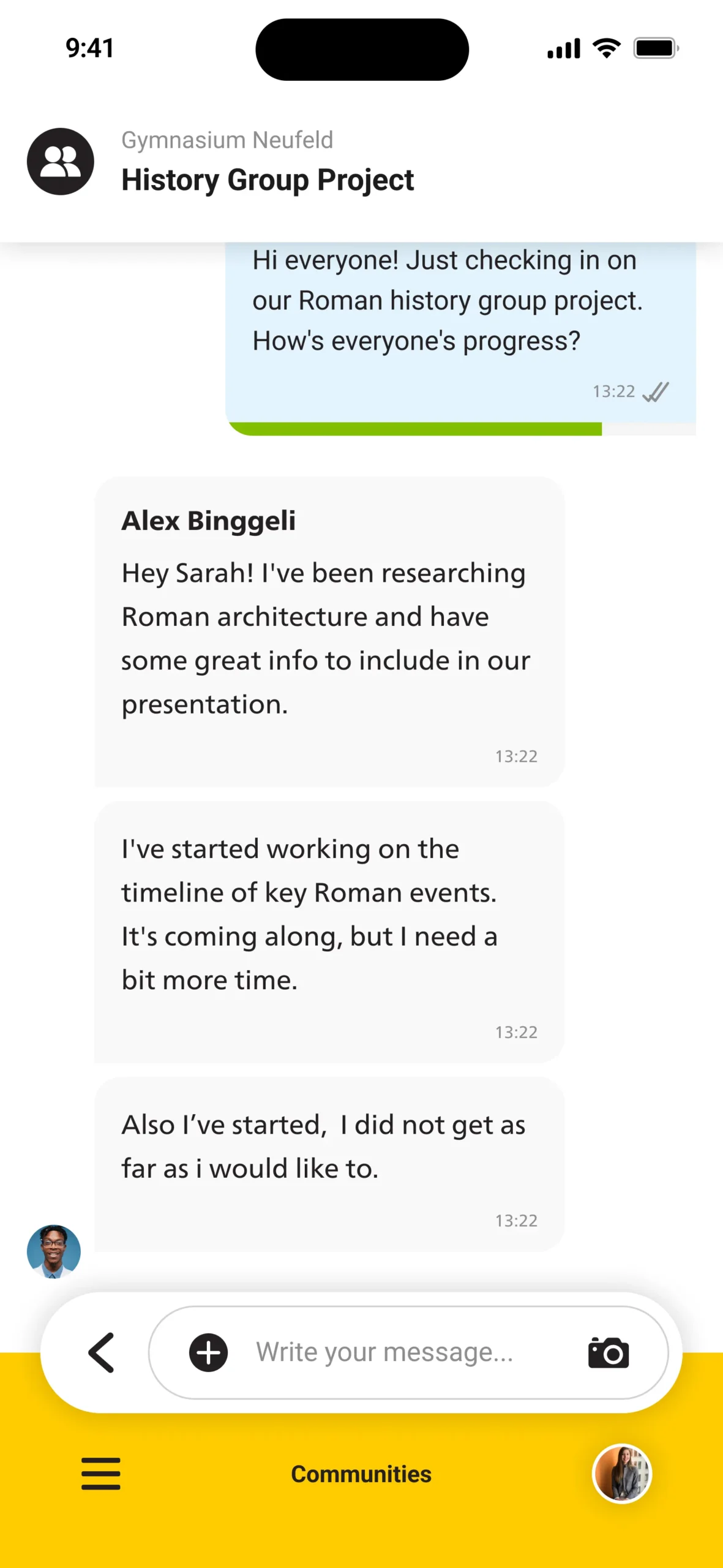
Unread Group Messages
Displaying partial read progress — the status bar shows how many participants have not yet viewed it.
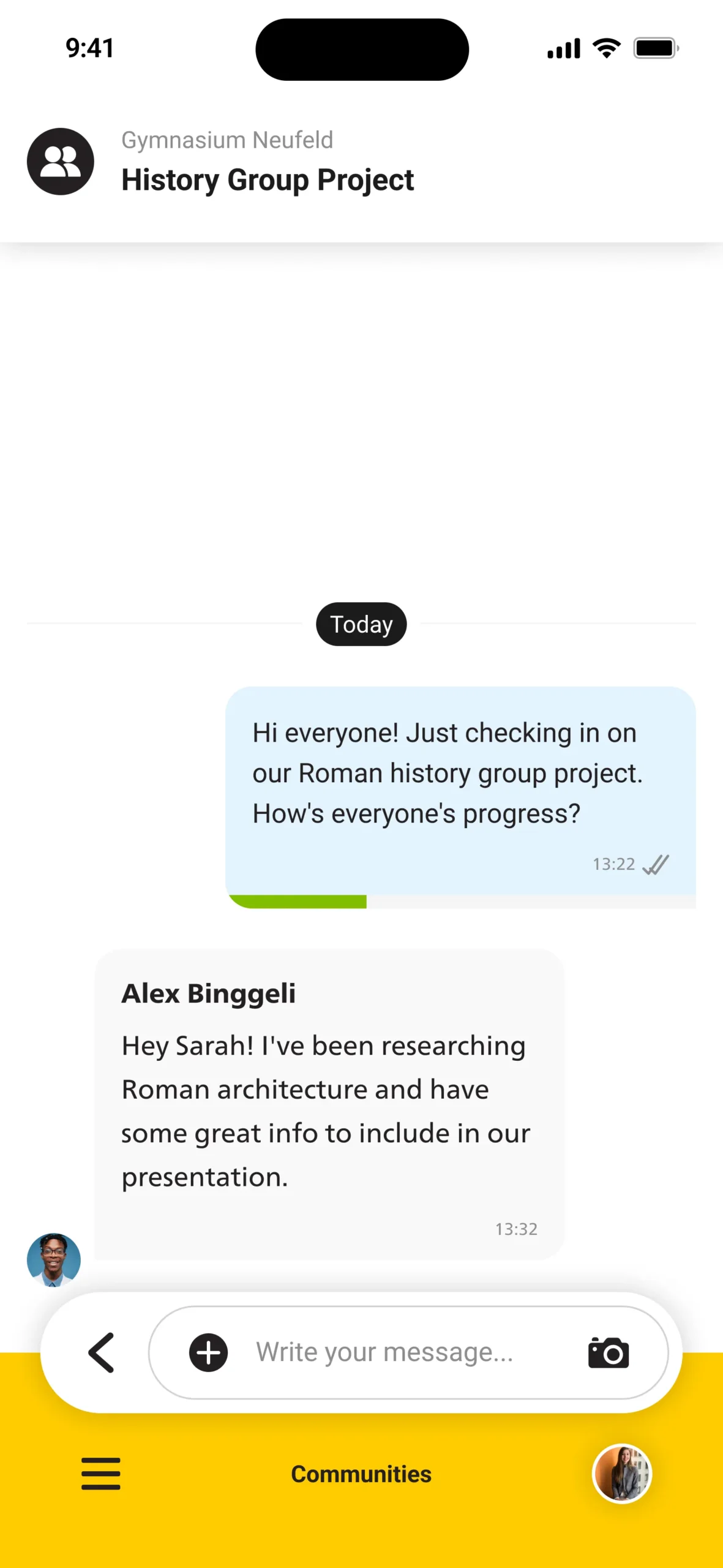
Read Group Messages
All participants have read the message — the progress bar is fully filled, indicating complete delivery.
Interaction & Behavior
The component dynamically adapts its states — from sending to read confirmations or user reactions. Smooth transitions and logical hierarchy help users understand message context instantly.
Design Principles / Implementation Details
Design Principles
Clarity: Message hierarchy is always clear, regardless of content type or context.
Consistency: All variants follow the same spacing, alignment, and color logic.
Scalability: Built as one master component with flexible variants for every use case.
Efficiency: Designers can adapt any message type without rebuilding layouts.

Implementation Details
Built in Figma using Auto-Layout and Variant Properties.
Boolean toggles control message states (e.g., “With Avatar”, “With Reactions”, “Grouped”), while property dropdowns define type and alignment.
Naming conventions follow a modular logic for easy reuse within larger design systems.
Reflection / Takeaways
This component represents my approach to building scalable, maintainable UI systems —
combining visual precision with flexible, logic-driven structures.
Designing it helped refine my thinking around state management,
accessibility, and the balance between clarity and visual rhythm.