Living Will
A clear, humane way to create an advance directive
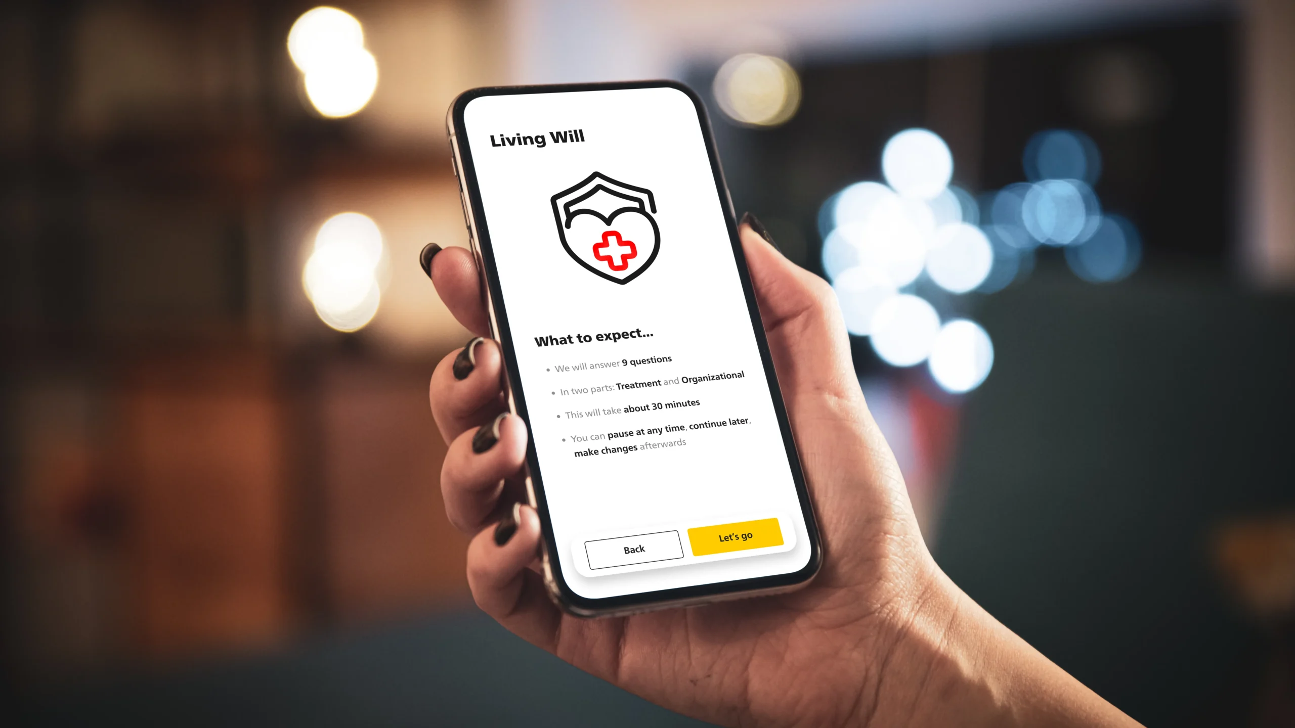
People struggle to write a legally valid living will because the process is abstract, emotional, and full of jargon. I designed a guided flow that turns tough decisions into small, understandable steps — so users can finish with confidence and share a clean, portable document.
Highlights
9 Questions
2 Parts: Treatment &
Organizational
Guided Flow
with progress &
inline help
Swiss-Sign
eSignature:
valid & fast
Auto add
to electronic
patient dossier
Problem & Goals
Why people don’t finish living wills (and what we solved)
The Living Will is part of the ePost Service AG Health area—a central hub where users manage medical records, appointments, medication reminders, and personal health history. My task: make creating a legally robust advance directive feel clear, humane, and finishable inside that ecosystem, with a result that’s stored digitally and can be printed as a wallet card for emergencies.
Define the Problem
Low Completion, High Stakes.
Traditional forms are long, abstract, and emotionally hard —
people abandon them or worry they “did it wrong.”
Legal Clarity vs. Usability.
Users want plain language; the document must still meet
legal expectations and be unambiguous.
Fragmented Journeys.
Health info, contacts, and documents live in different places;
users don’t know what they need at each step.
Mobile-first Reality.
Most interactions happen on phones;
small screens amplify cognitive load and form friction.
Trust & Privacy.
Sensitive data requires a calm tone, transparent choices,
and GDPR-compliant handling.
Set Goals
Finishable Flow.
Break decisions into small, named steps (values → contacts → review → sign),
with a clear sense of progress and the option to pause/resume.
Plain Language in Place.
Inline definitions and short examples where confusion typically arises.
Legally Sound Output.
Generate a clean, printable PDF that reflects user choices
and supports required signatures/witnessing.
Seamless Ecosystem Fit.
Reuse the Health area’s patterns
and sit next to reminders and medical records.
Share & Store.
Save securely in the app;
allow export/sharing for caregivers and clinicians;
include a condensed Wallet-Card layout.
Accessible by Design.
AA+ contrast, larger tap targets, screen-reader labels and predictable focus order.
Calm Tone.
Reduce anxiety with empathetic microcopy and gentle validations.
Acknowledge constraints
In-App Integration.
Must run inside the ePost Service AG app shell/design system and
perform well on mid-range Android/iOS devices.
Jurisdiction & Wording.
Copy and structure tailored to the target legal context (Switzerland);
avoid medical/legal jargon unless defined inline.
Data Protection.
GDPR-compliant storage and consent flows; no unnecessary data retention;
clear export/delete options.
Offline Resilience.
Graceful handling of spotty networks (local draft + sync),
especially near signature/finalization.
Signature & Witnesses.
Support the required signing flow and capture; produce a print-ready
version suited for a wallet card.
No heavy Prerequisites.
Users should be able to start without creating separate accounts,
and continue later from the Health area.
Scalable Copy System.
All helper texts and definitions managed centrally for
updates and localization.
Research & Insights
What research revealed (fear, language, agency)
Methods
Competitive scan:
Compared structure, language tone, length, and decision logic. Marked friction points (legalese, branching overload, unclear “when this applies”).
Language audit:
Flagged jargon and ambiguous phrasing; mapped to plain-language equivalents and microcopy patterns.
Non-expert interviews:
People with interest but no prior living will. Explored motivations, blockers, and mental models.
Task walkthroughs:
Asked participants to “start a living will” with competitor flows, noted points of confusion and abandonment.
Early Testing:
Users were involved early on and extensive and repeated testing took place at all stages.
Content prototyping:
Iterated wording and question order in Figma; quick hallway tests to validate clarity before UI polish.
Key Insights
Overwhelm kills intent:
Most flows present long forms and legal text up front → users postpone or abandon.
“When does this apply?” is unclear:
People want a easy, plain answer to when their living will becomes active—not weird subtly different scenarios.
Language must be calm & direct:
Neutral, supportive tone reduces anxiety
One path, not three branches:
A linear case, outperformed branching wizards. Users want guided decisions with one current focus.
Contextual help beats FAQs:
Inline explanation and tooltips resolved most uncertainties without leaving the flow.
Progress + save is essential:
Visible progress and save/resume lowered drop-offs; users want to pause and revisit.
Export & proof matters:
The ability to store digitally, print a wallet card, and share with family/doctor was a top trust signal.
Design decisions
(derived from insights)
Single activation rule, explained first:
Clear, human first screen: “This living will applies if…” reinforced by a short example.
Chunked steps, one decision per screen:
Each step = 1 question, 1–2 sentences of help, info icon to learn more.
Plain-language microcopy:
Short sentences; “i” popovers.
Inline reassurance:
“You can change this later.” “Your answers are private.” “You can print a wallet card.”
Visible progress & resume:
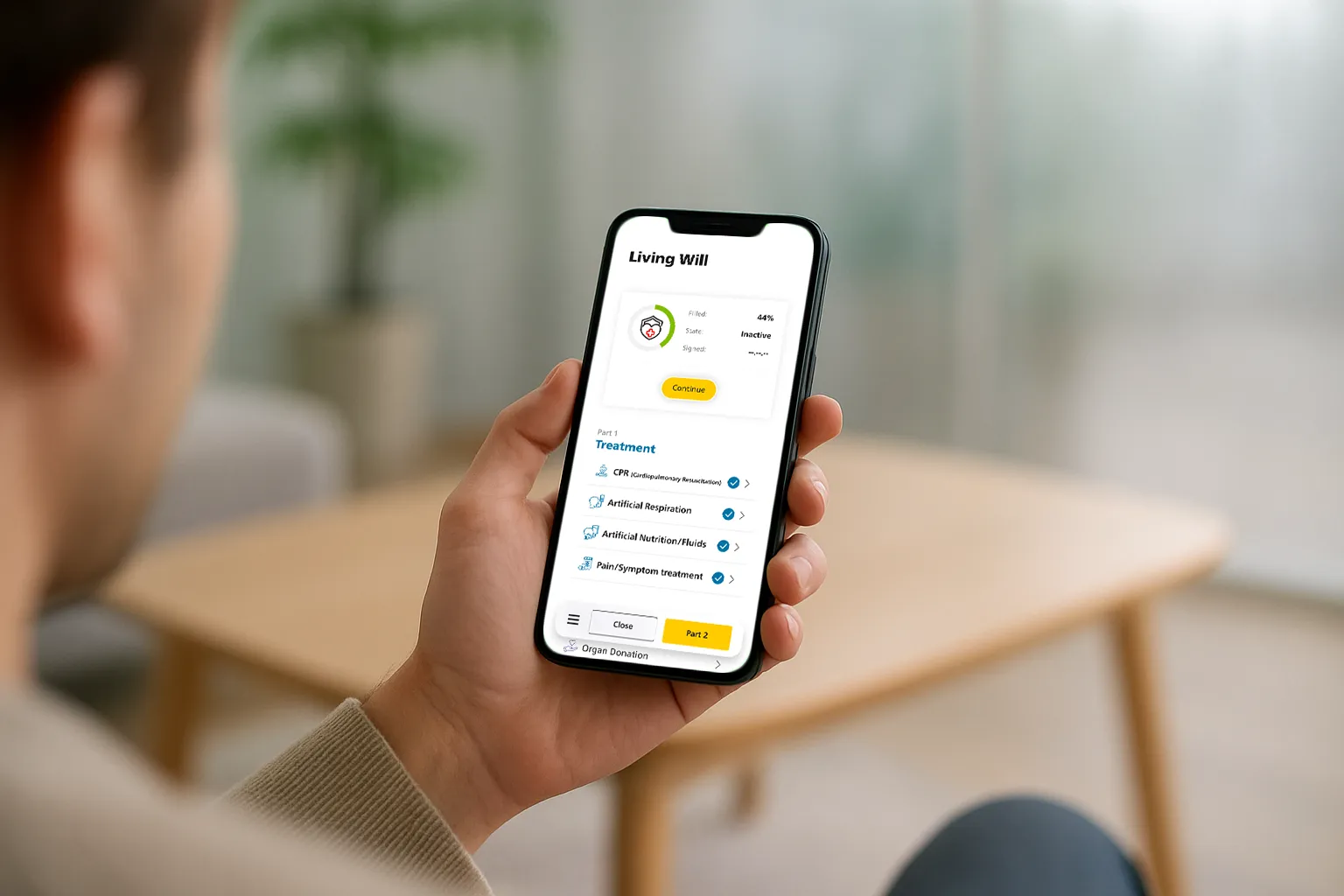
Step counter + autosave; return via app homepage “Continue your Living Will”.
Output you can trust:
PDF summary, digital storage, optional print formats (A4 + wallet card).
Flow & Information Architecture
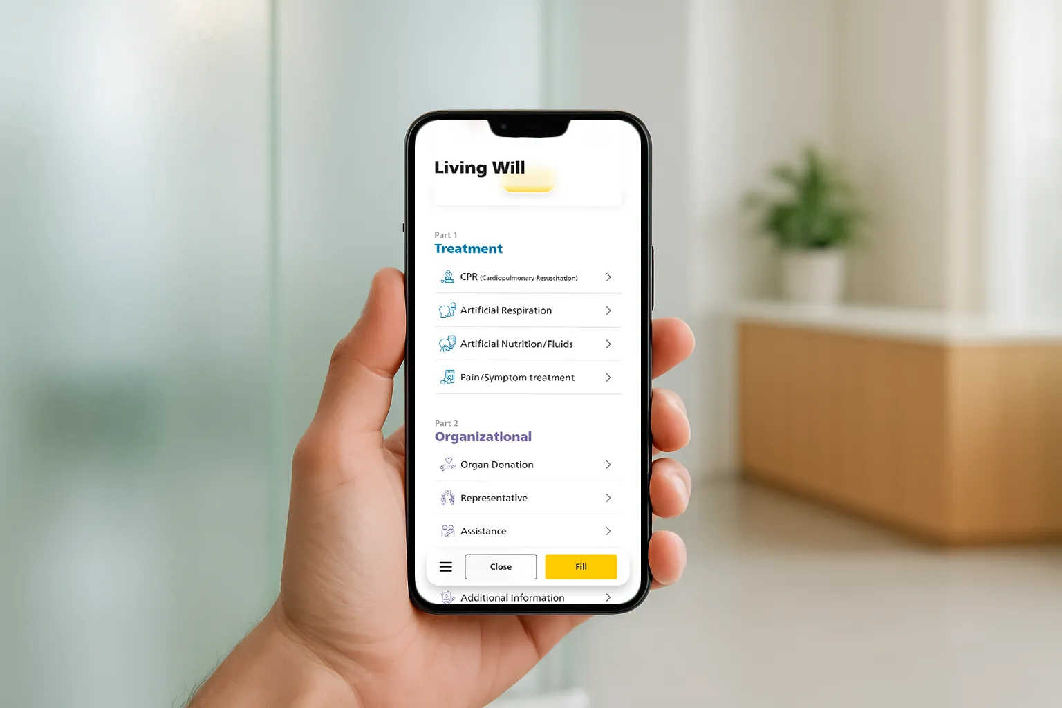
The 9-step flow (2 clear parts)
Step-by-Step Flow
Health hub → Living Will (entry)
Welcome Screen
What to expect
Overview Hub
(2 parts: Treatment & Organizational)
Part A – Treatment
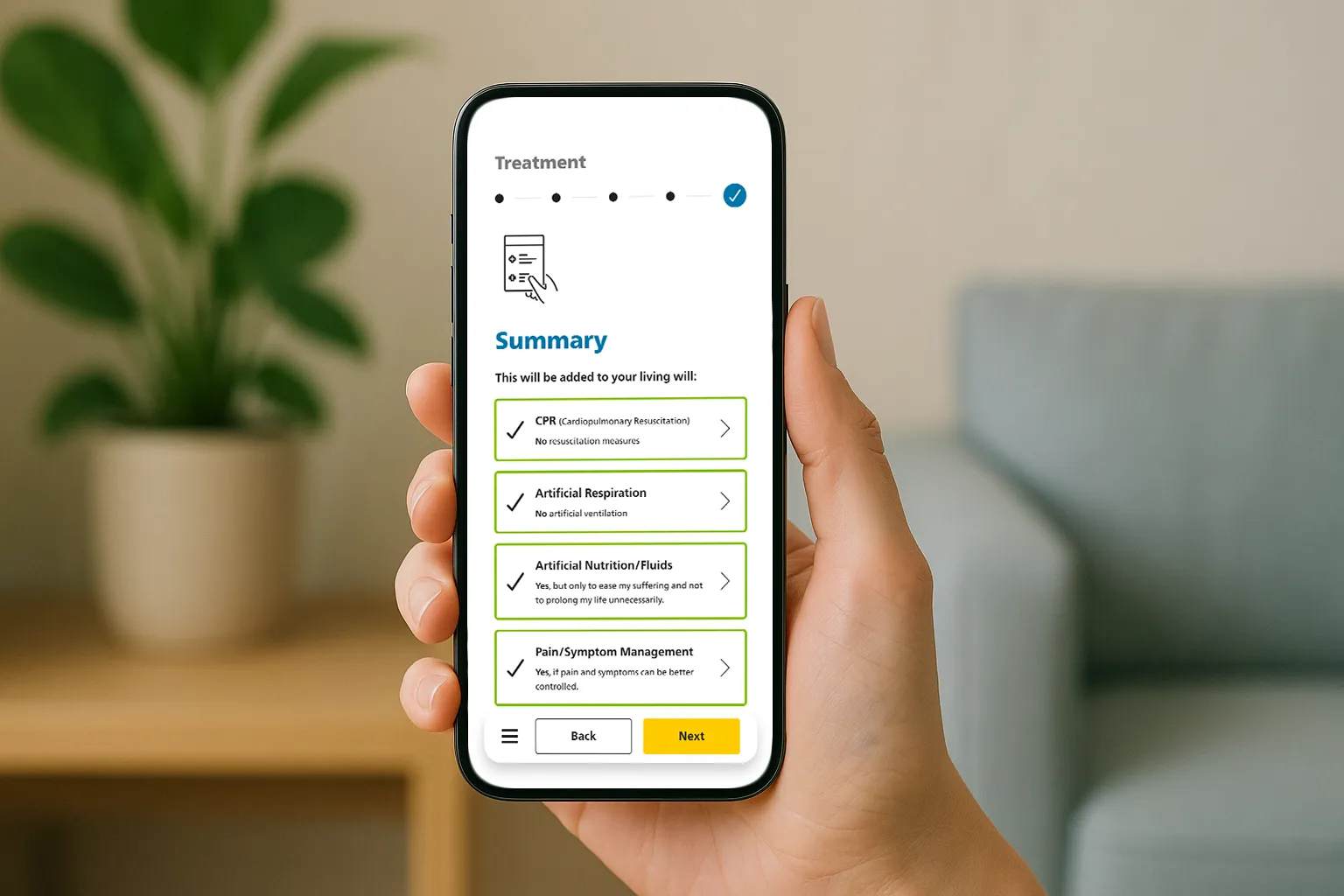
(4 questions) → Summary A
Return to Overview
(part A checked)
Part B – Organizational
(5 questions) → Summary B
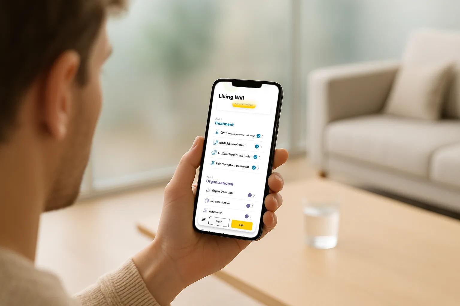
Global Summary
(unanswered items flagged, still valid)
E-signature (Swiss-Sign)
Confirmation & Outputs:
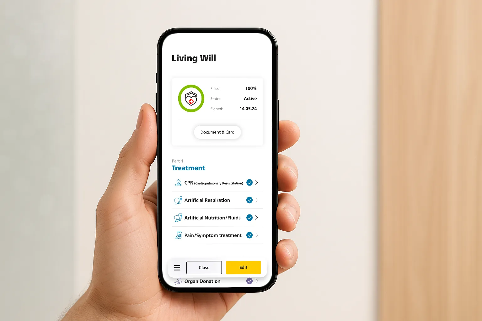
stored in EHR, printable wallet card, shareable PDF
Information Architecture
Screens
Intro cluster: Welcome → What to expect
Hub: Overview (lists Parts & item states)
Flow A: A1–A4 question screens → Summary A
Flow B: B1–B5 question screens → Summary B
Global: Summary → E-signature → Confirmation
Ancillary: Tooltip / Help, Share sheet
Content entities
LivingWill (id, status: draft/signed/active)
Part (A|B, progress, completed)
Decision (key, value, rationale, updated)
People (representative, assistance: name, relation, contacts, permissions)
Outputs (Pdf, Card Template, Links to share)
Telemetry (stepView, tooltipOpens, saveResume)
Navigation, State & Guidance
Progress: Treatment (“x/4”) + Organizational (“Step x/5”) to set expectations.
Save/Resume: Autosave on each decision; “Continue Living Will” entry on app health overview.
Inline help: “?” tooltips for questions; never pushes users away from the screen.
Edit paths: Every summary supports in-place edits; Overview supports deep-link to any item.
Empty states: Clear callouts (“Not set yet — optional”) + “Set now” micro-CTA.
Validation: Soft validation (warns, doesn’t block), except for legal minimums before signature.
Accessibility: Big enough targets, logical tab order, ARIA for step counts.
UI-Highlights
Micro-copy, icons & progress that reassures
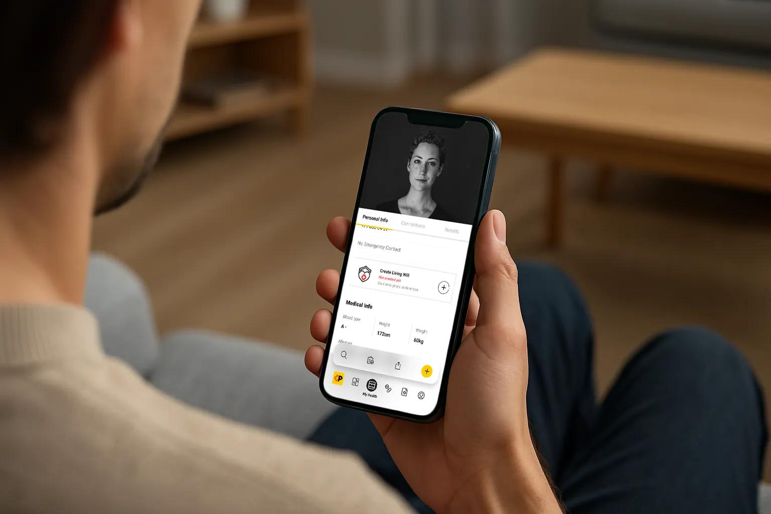
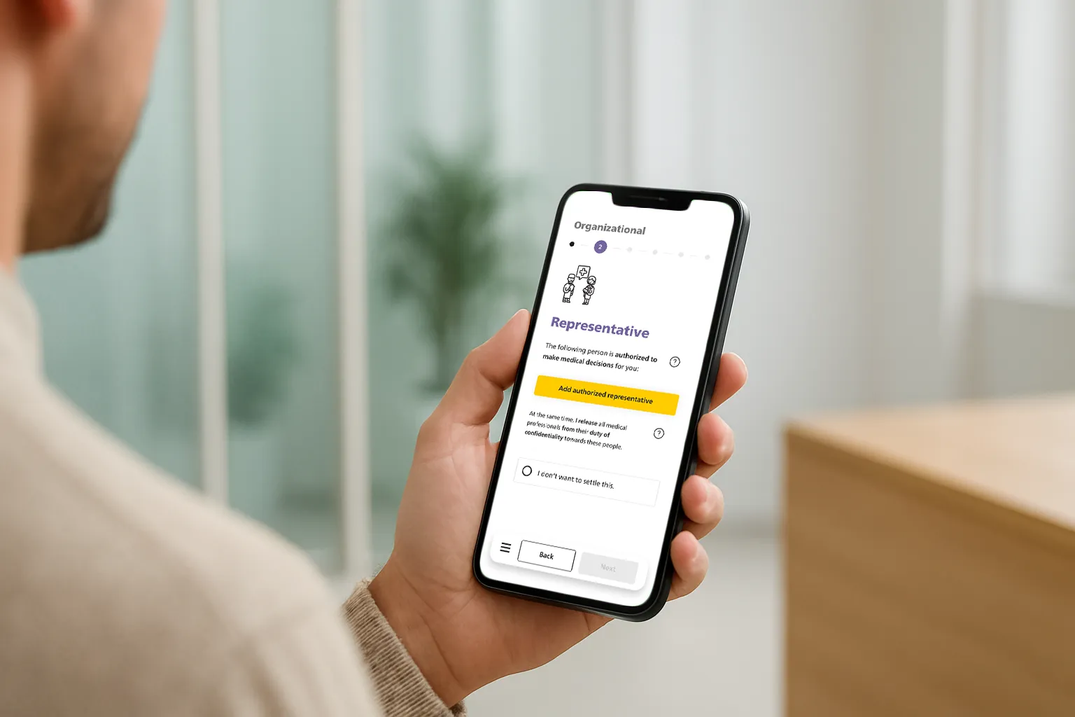
Plain-language questions
Big, single-focus prompts; optional “What does this mean?” popovers.
Pre-answered examples to set the tone.
Progress with no pressure
“You can finish later” is always visible; autosave after every step.
Subtle progress meter (steps, not %).
Error & edge cases
Gentle in-context alerts (“This conflicts with X—do you want to revise?”).
Accessible focus states and smart defaults.
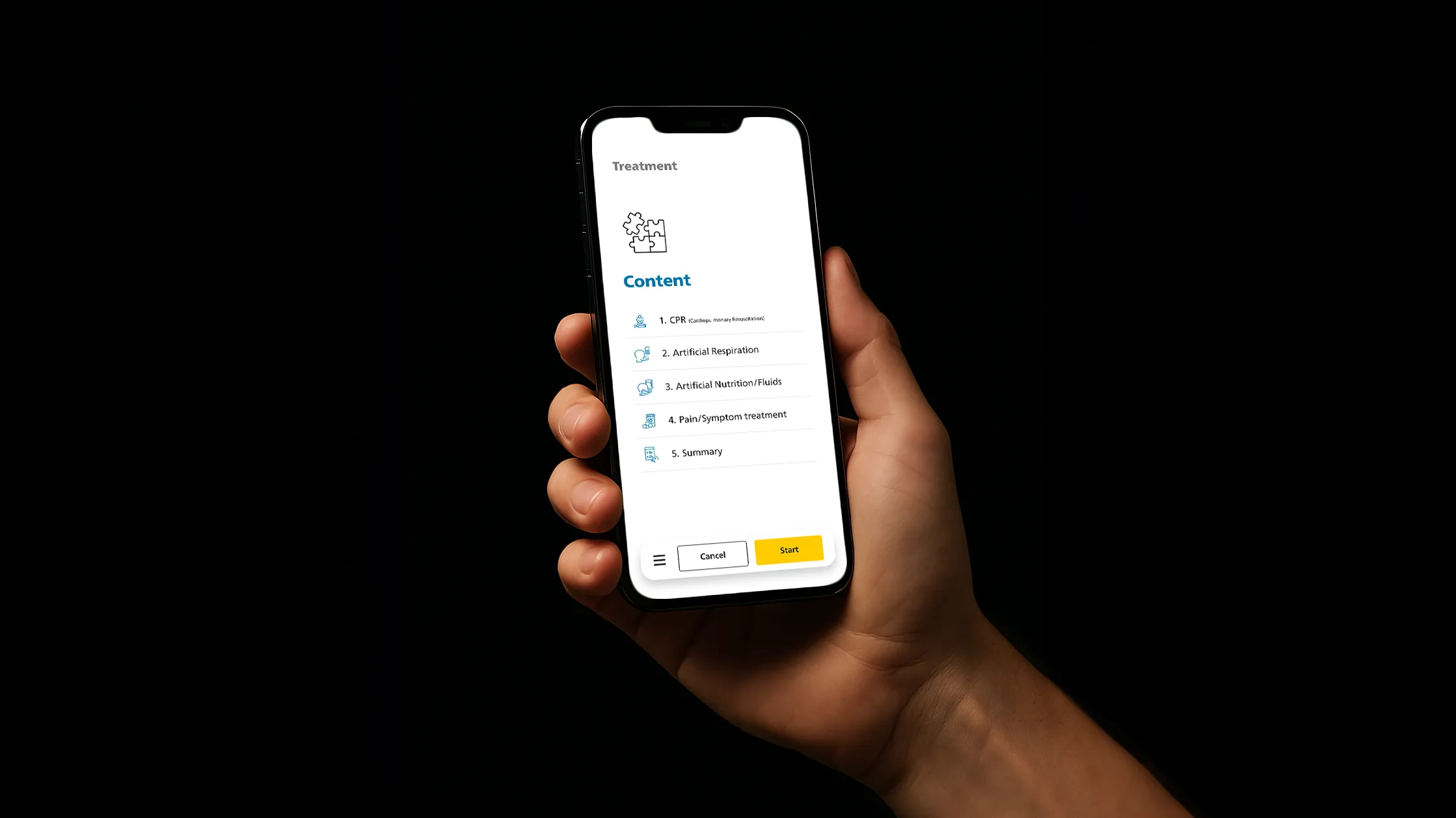
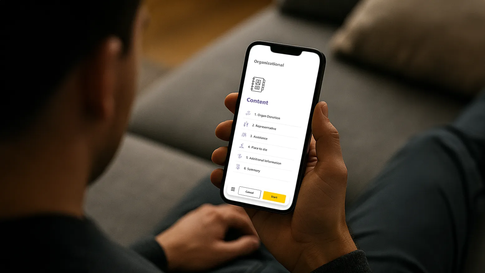
Tokens
Type scale
tuned for legibility
Spacing
8-pt grid; generous line height.
Color
calm neutrals, two accents for categories.
Elevated contrast
for text and controls (AA+).
Components
Process Bar
with progress, back, and “Save & exit”.
Choice cards
with inline helper text.
Review checklist
(tappable to jump back).
Signature capture
with “Reset” and “Preview PDF”.
Outcomes & Learnings
Results & what I’d do next
What improved
Less Backtracks
thanks to inline “?” explains on questions and answers.
Less Contradictions
via tighter review screen (clear, single-source decisions).
Language simplified
less jargon, shorter sentences, plain words.
Content volume reduced
trimmed non-essentials, chunked info.
UI decluttered → clean
hierarchy (spacing, icon cues, process steps).
More Confidence
through “valid even if not all answered” microcopy.
Less signature path friction
with clear Swiss-Sign route + status feedback.
What I’d iterate next
“Talk-it-through” wizard
for tough choices (guided prompts, examples).
Text-to-speech
for long guidance to lower reading load.
Sharing options:
secure QR for med staff +
printable emergency card.
Localize legal notes
for 1–2 pilot regions
(terminology, consent nuances).
Finalize outputs:
document layout + wallet card specs
(print & digital).
Have a sensitive, high-stakes flow?
I can help you turn complex decisions into calm, finishable journeys —
from research to prototype to implementation.